Showing posts with label SSRS. Show all posts

Monday, January 21, 2013

Design tips for My favorite dashboard.

Dashboards are very popular way to display data. Other popular names are (performance) cockpits. Sometimes I see dashboards for which I think, which vision is used to build such a bad dashboard. If you start building a dashboard without a vision it will end up in a dashboard which maybe looks nice as a first impression, but is useless on a daily basis. In this blog post I will describe my vision how you should build a useful dashboard. First of all I will start with 2 examples of a dashboard. Both will show the same information. The only difference is the presentation of the data. Examples are the best way to explain.
Let's start with a dashboard in which a lot of improvements can be made:


Now the same information in presented in a better way:


I will comment on the dashboard which can be improved. In general one rule can be applied: Keep in mind. Less is better.


  1. Report title in big font and printed Bold. Goal of the dashboard is to show attention to the figures not to the title.
  2. Gray background in the report. This is visual fluff. The gray color has no function. Keep in mind. Less is better.
  3. Axe values. A lot of zero's is expensive space and is difficult to read. It will make the bar chart it self smaller. We read with our brains. Is the axis value 200.000 or 2 million? 
  4. Red color of the bar chart. Is something wrong? Colors have a function. Red is a color to grab attention that something is wrong (STOP). In this example nothing is wrong. Revenue is better than previous year.
  5. 3D graph. A dashboard is not a painting. The dashboard is used in a business environment. Not in a gallery. Always use 2D graphs. They are easier to read and understand. For example: What is the value for period 2 of previous year?
  6. Aqua color with gradient style center. This is visual fluff. Keep in mind. Less is better.
  7. Legend takes a lot of valuable space which result in a smaller bar chart. It's not the legend but the chart which need to most space. 
  8. Numbers should not be center-justified in the columns. Right-justified is easier to compare when scanning up and down a column.
  9. Use grid lines carefully. Keep in mind. Less is better.
  10. Matrix header in bigger font, printed bold on a colored background. One way of visualization is enough to emphasize difference between the lines. Using a list level for other lines will show difference between header and sub-lines. Keep in mind. Less is better.
  11. Underline the header. This is useless. Keep in mind. Less is better.
  12. Repeating currency symbol. One currency symbol is enough. Is will save value space in every column.
  13. Hyperlink to other report is printed in the same font color. Use a other color for hyperlinks, so the user can see that a hyperlink to another report is available.
  14. Remove the border of the bar chart.
Some more remarks to take into account during the design of your dashboard.
  • A dashboard is used on a daily basis. Display only data which needs your attention, so you can take action to improve. Report the KPI's which needs improvement. The dashboard need to help you to achieve your goal. Data content which will not change overtime is use less on a daily used dashboard.
  • We do not see with our eyes, we see with our brains. Content on the dashboard should be clear to understand. If people need to think about what they see, you need to change the visualization of your information.
  • A dashboard should fit on one screen. Avoid scrolling bars. With scrolling bars, it can happen that something that needs your attention (RED) is outside your screen.
  • Do not use shadows. It is visual fluff with no meaning.
  • Do not use logo's and pictures. It is wasting your valuable space. If needed make it small and place it somewhere out of the way.
  • What do you want to show or compare? Based on this select the best visualization for it. See : http://www.keepitsimpleandfast.com/2012/07/which-visualizations-should-i-use-in-my.html For example using a pie chart to compare 2 values can be useful  However it can take a lot of useful space. Do not use is to compare multiple values especially if you do not know how many values you need to compare. A bar chart is better in this situation.
  • Display consolidated information, summaries or exceptions. Do not display details. Details are used in slice and dice reports to explain the consolidated information, summaries or exceptions.
  • Put data which is relevant to each other, close together.
  • Use a gray color for your fonts instead of black.
Enjoy it to build dashboards to deliver a good user experience for your users. 

Thursday, December 13, 2012

SSRS reports on the IPad or IPhone has been improved since SQL 2012 SP1

Almost 2 years ago I wrote a blogpost about SQL Server Reporting Service (SSRS) Reports on the IPad or IPhone. I was the first time you could display SSRS reports on the IPad. Unfortunatly not everything was rendered in a correct way. In SQL Server 2012 SP1 this has been improved.

Here is an example of a report in SQL 2008 R2


 Here is an example of the same report in SQL 2012 SP1
As you can see, the strange Blue Question marks are gone.

Starting with SQL 2012 Service Pack 1 (SP1), Reporting Services supports viewing and basic interactivity with reports on Apple iOS devices like IPad en Iphone, with the Apple Safari browser.
Viewing reports in Report Manager (http://myserver/reportserver) is not suppported. You need to start the reports from the report server via http://myserver.reports. Here you can browse to the report and tape the report name to open the report. After opening the report yiu can see that the Export to PDF and TIFF file is supported. More information about the support for Apple iOS devices on SSRS can be found here.
For a video of using SSRS on your Ipad please see:


Wednesday, August 8, 2012

How to use Dynamic data sources in your SSRS report.


You can have situations in which your report should be executed on multiple databases. The user should be able to select the desired database on which the report should run. In this blog post I will explain how you can do this.
To be able to select to different database you need to make use of a dynamic data source. A data source makes use of a connection string. It is possible to pass the connection string of a data source as an expression. By using an expression, you can make use of parameter values to pass the servername and database name to the connection string. There is only one restriction of a dynamic data source. The data source should be embedded within the report. It can not be implemented with a shared data source. In this blogpost I will use a second database in which I retrieve the available SQL server\databases on which my reports should be executed.
  • Open your report
  • Add 2 report parameters
    • ServerName
    • DatabaseName
  • Add datasource named: DynamicDataSource. Use the a 'hard coded' connection string. For instance:  Data Source=MySQLServer1;Initial Catalog=MyDatabase1.

  • Add datasource to the database with all SQL Server\databases. In my example named: Synergy
  • Add a embedded dataset to retrieve SQL Server and Database information.
  • Configure the available values for the report parameters: ServerName and DatabaseName.
  • Add all datasets and report items to your report.
  • Test your report using the 'hard coded' connection string.
  • If everything works fine, change the 'hard coded' connection string with next expression
    ="data source=" & Parameters!ServerName.Value & ";initial catalog=" & Parameters!DatabaseName.Value
  • Run the report and select a value for the report parameters ServerName and DatabaseName 

Enjoy it.

Thursday, July 5, 2012

Which visualizations should I use in my dashboard or cockpits ?

With SSRS you can build very nice reports. You can make use of a lot of different report types like:
  • Table
  • Tablix
  • Chart
  • Gauge
  • Map
  • Data Bar
  • Sparkline
  • Indicator
Every report type has it's own purpose. To make your reports a success, the report should directly tell you what you need to know. One aspects of this, is to apply the dashboard design rules to your reports.
Another aspects is to choose the best report type. I will use a tree stucture you can use to select the best report type.  For your report you should answer yourself some questions about the report:
  1. Comparison
    1. Among Items
      1. Two variables per Item: Variable width column chart
      2. One variable per Item
        1. Many categories: Table
        2. Few categories
          1. Many Items: Bar Chart
          2. Few Items: Column Chart
    2. Over Time
      1. Many Periods
        1. Cyclical data: Polar Chart
        2. Non Cyclical data: Line Chart
      2. Few Periods
        1. Single or Few categories: Column Chart
        2. Many categories: Line Chart
  2. Relationship
    1. Two variables: Scatter chart
    2. Three variables: Bubble chart
  3. Distribution
    1. Single variable
      1. Few Data Points: Column Histogram
      2. Many Data Points: Line Histogram
    2. Two variable: Scatter Chart
    3. Three variable: 3D Area Chart
  4. Composition
    1. Changing over time
      1. Few Periods
        1. Only relative difference matters: Stacked 100% Column Chart
        2. Relative and Absolute difference matters: Stacked Column Chart
      2. Many Periods
        1. Only relative Difference matters: Stacked 100% Line Chart
        2. Relative and Absolute difference matters: Stacked Line Chart
    2. Static
      1. Single Share of Total: Pie Chart
      2. Accumulation to total: Waterfall Chart
      3. Components of Components: Stacked 100% Column Chart with Sub components.
A nice picture of this tree structure can be found on : http://extremepresentation.typepad.com/photos/uncategorized/choosing_a_good_chart.jpg


Click on the picture to enlarge.

Some observations:
  • Pie Charts are ONLY used to show Simple Share of Total.
  • Over Time Difference between few periods (Column charts)  and many periods (Line Charts).
  • 3D is ONLY used to display distribution of 3 variables. 
  • Few variables (Column Histogram) versus Many variables (Line Histogram)
Select the report type which is the best to show your data, therefor do NOT select a report type because it looks nice. If you want to have something which is nice, please buy a painting.

Enjoy using this tree structure, to select the best report type for you report.

Friday, May 18, 2012

How to create a timeline in a SSRS report.


Timeline reports can be very usefull to display what is happening during a specific time period. For instance, you have a server on which a lot of background tasks are running. In the beginning, you know which jobs are running at which moment. However, when the number of jobs are increasing, you will lose the overview. Especially when the execution times of the background jobs are taking longer after a while. A timeline report will help you to visualize all running background jobs. In SQL Server Reporting Services (SSRS) their is not a standard reporting item to make a timeline. However, there is a way to do this with the current report items. In this blogpost, I will explain how you can make a timeline report. I will use the example to display which backgroundjobs are running on which moment.

First of all we need to have a dataset which the execution times and durations of the backgroundjobs.
I have table named: Activitylog. In this table the starttime of the background job is registered including the execution time (duration).

SELECT StartTime, APP, Duration FROM ActivityLog

The report will have 4 filters to specify a date range. This date range is divided in a date and hour of thedate on which the backgroundjobs have been executed. (@MeasureDateStart, @MeasureDateEnd, @MeasureHourStart, @MeasureHourEnd)

This will results in a dataset which calculates the EndTime of the backgroundjob based on the StartTime and duration of the backgroundjob. It will use the parameters: @MeasureDateStart, @MeasureDateEnd, @MeasureHourStart, @MeasureHourEnd to select the data you need. All backgroundjobs will be displayed which have a start time and or end time within the selected time period.
SELECT AL.App, AL.StartTime,
DATEADD(ms, AL.Duration, AL.StartTime) AS EndTime, AL.Duration

FROM ActivityLog AS AL
WHERE (AL.StartTime >= @MeasureDateStart) AND
(
DATEPART(hh, AL.StartTime) >= @MeasureHourStart) AND 
 
(DATEADD(dd, 0, DATEDIFF(dd, 0,DATEADD(ms, AL.Duration, AL.StartTime))) <= @MeasureDateEnd) AND
(DATEPART(hh, AL.StartTime) <= @MeasureHourEnd) 


The dataset is ready for use.
  • Start Business Intelligence Development Studio(BIDS) and create a new report with a datasource to the database and define the dataset.
  • All defined parameters in the dataset will be added automatically to the report.
  • Add the report item Chart and select the Range Bar.
  • Define the chart, Values: Startime ;Series Groups: App ;Category Groups Details.
  • Configure the StartTime by opening the series properties.
  • if desired you can configure the tooltip to show additional information.
  • Configure the horizontal Axis to display the hours by opening the properties and select custom format: hh
     
  • Your report is ready for use and should look like the first picture in this blogpost.

Tuesday, May 8, 2012

Auto refresh of SSRS reports.


In some situations you want to use a SSRS report to monitor activity on your solution which requires some action of people. For instance your internal helpdesk has made an overview of the number of logged errors in the last 10 minutes. This overview will help the helpdesk in their daily operation. In SSRS you can configure your report to refresh automatically. Of course you should be very carefully in implementing this feature. It can result in a lot of recurring datbase activity which can have a big impact on the overall performance of your solution.

To configure auto refresh of your report, open the property windows of your Report. In the Other section you will find a property AutoRefresh. Sets its value to 60 and the report will auto-refresh every 60 seconds.


Picture: Milford Sound, New Zealand Dec 2011.

Tuesday, April 24, 2012

The difference between drill down and drill through reports.


During the design of reports and dashboards I have seen that a lot of people do not know the difference between drill down and drill through reports. In most situations people uses the term: Drill down for both situations. However, there is a difference between these reports.

Drill through reports:
A drill through report allows you to go from summary to detail. For instance: You have a financial application in which you can show the balance and profit and loss for a specific time frame. Every general ledger displays the total amount of all transactions for this specific period. By clicking (Drill through) on one of the general ledgers you will see the underlying transactions for this specific period.

Drill down reports:
A drill down reports allows you to look to the data in different levels. For instance, a report displays information on Country level if we drill down the report displays information on state level. Next drill down will display information on city level. So Countries contains States, States contains Cities. So we can view all levels through drill down.
Another examples is Year contains Months, Months contains Weeks, Weeks contains Days, Days contains Hours, Hours contains Minutes.

Picture: My drill down from the Kawarau Bridge, New Zealand Dec 2011

Thursday, April 19, 2012

How to display a multi value parameter in a text box in SSRS.


In my previous blog I described how you can pass a multi-value parameter to another SSRS report via drill through. After doing this, sometimes you want to show the used multi-value parameters in a text box. The solution for this is very simple. This can be achieved by using the JOIN function. I will explain with an example @Hostname as multi-value parameter.
Open the text box and define next expression:

="My own text: " + Join(Parameters!Hostname.Label,", ")


Other blog post about multi-value parameters: How to pass NULL value to a multi-value parameter in SSRS?

Picture: Milford Sound, New Zealand Dec 2011.

Tuesday, April 10, 2012

Passing Multi-value parameter to drill through SSRS report.


Last week I was building Report A with a multi value parameter called @Hostname. The values selected for the @Hostname parameter should be passed to Report B with the same multi value parameter. This failed because the dataset expects a valid IN clause. I will explain what happens with an example:
Multi value Parameter: @Hostname
Dataset: Select col1, col2 col3 FROM TableX WHERE Col4 IN (@Hostname)

In this case reporting server tries to add multi values like:
Select col1, col2 col3 FROM TableX WHERE Col4 IN (Server1,Server2,Server3)

This query syntaxt is wrong. It should be
Select col1, col2 col3 FROM TableX WHERE Col4 IN ('Server1','Server2','Server3')

This can be achieved by using next expression in the action for the parameter field:

=SPLIT(JOIN(Parameters!Hostname.Value,","),",")

With this expression the correct TSql syntax will be generated.

Happy building your reports. Enjoy It.

Picture: Mount Cook, New Zealand Dec 2011.

Wednesday, March 14, 2012

How to pass NULL value to a Multi value parameter in SSRS?


This week I tried to build a SSRS report with a parameter which can have multiple values including the NULL value. This is not possible by default in SSRS. When you configure the parameter with option: Allow null value and Allow multiple values. You will receive next error message:

A multi-value parameter cannot include null values.

The reason for this is the TSql syntax of the underlying dataset.

SELECT Column1, Column3
FROM TableX
WHERE Column2 IN (@MyParameter)

This query will fail for the NULL value because IN syntax is in conflict with NULL value. TSql syntax for NULL values is

SELECT Column1, Column3
FROM TableX
WHERE Column2 IS NULL

Solution:
We are going to use the ISNULL function to change parameter values to a blank value (''). Assume you have a dataset to retrieve parameter values for @MyParameter.

SELECT DISTINCT(Col1) FROM TableB

Change this query to:

SELECT DISTINCT ISNULL(Col1, '') AS Col1, ISNULL(Col1, 'NULL') AS Col1Description
FROM TableB
Change the Report Parameter Properties to: Allow blank values ('') and Allow multiple values.
Change the available values: Value field: Col1   , Label field: Col1Description.


Now we need to change the query of the dataset.
-- Original query
SELECT Column1, Column3
FROM TableX
WHERE Column2 IN (@MyParameter)

-- Changed query
SELECT Column1, Column3
FROM TableX
WHERE  ISNULL(Column2,'')  IN (@MyParameter)

That's all, enjoy it to make your report more user friendly.

Wednesday, March 7, 2012

Argument data type nvarchar is invalid for argument 2 of dateadd function.


Situation:
I have build a query, using the DATEADD function, which executed without any error in SQL Server Management Studion (SSMS). I want to use this query as a dataset in my SQL Server Reporting Service Report (SSRS). I paste the query in the query designer window of my dataset. After I press the OK button of the Query designer, I got next error message:

Argument data type nvarchar is invalid for argument 2 of dateadd function.

This is the part of the query with the DATEADD function:
(SELECT DATEADD(HOUR, @MeasureHourStart, @MeasureDateStart) AS XXXX)

In my report I have report parameters @MeasureHourStart (INT) and @MeasureDateStart (DateTime)

Solution:
SSRS still sees @MeasureHourStart as a Varchar value.

As a workaround I forced to set the value of @MeasureHourStart as an Integer by using the CAST function.
(SELECT DATEADD(HOUR, CAST(@MeasureHourStart AS INT), @MeasureDateStart) AS XXXX)

Now the query will be accepted by SSRS as a valid dataset.

Tuesday, February 28, 2012

How to show a section in a SSRS report based on a parameter?

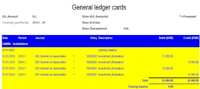
Today, I got a question how you can display a section in a SQL Server Reporting Services (SSRS) report based on a parameter value. In this blog I will describe how you can achieve this. I will make use of a general ledger card as example. This general card will show financial entry information. Depending on the parameter value: CostAnalysis it will show costcenter information.

Photo credit: Nisha A

Example of general ledger card without costcenter information:
Example of general ledger card with cost center information:

How to achieve this?
  • Add a extra detail line in the report for the costcenter columns.
  • Add the costcenter columns to this detail line.
  • Add a parameter CostAnalysis to your report. In this example I will make the posibility to choose to display the costcenter code or the costcenter code + costcenter description.
  • Select Available Values, Specify values and Add 3 labels
  • Specify default value 0. So costcenters will not be displayed by default.
  • Select the costcenter detail line of the left. Right mouse click and select row visibility.
  • Select Show or Hide based on expression. Add next expression:
    =IIF((Parameters!CostAnalytics.Value=0) True,False)
    This will display the costcenter line if parameter value = 1 OR 2
  • In the costcenter columns we need to add logic to display only the costcenter code or the costcenter code + description. Select the costcenter column and add next expression to this column: =Fields!Costcenter.Value + IIF (Parameters!CostAnalytics.Value = 2, " - " + Fields!CostcenterDescription.Value, "")
    This will print the costcenter code and only the description in case the CostAnalytics parameter value = 2
In this way you can do the same for currency information etc.
Enjoy it to build nice customer experience reports.

Monday, November 28, 2011

Executionlog of SQL Azure Reporting reports .


In one of my previous blogs I wrote about performance tips to improve the performance of your SSRS reports. In this blog I wrote about the 3 different performance elements during the execution of a report:
  1. Time to retrieve the data (TimeDataRetrieval).
  2. Time to process the report (TimeProcessing)
  3. Time to render the report (TimeRendering)
Total time = (TimeDataRetrieval) + (TimeProcessing) + (TimeRendering)

As of SQL Server 2008 R2, this 3 performance components are logged every time for which a deployed report is executed. This information can be found in the table Executionlog3 in the ReportServer database. In SQL Azure Reporting you can't access the ExectionLog3 table, however it is still possible to get the contents of this table. To get the contents of this table do the following:

  1. Login to the Azure Management Portal.
  2. Select Reporting
  3. Select your reporting subscription.
  4. Press the Download Execution Log button in the top of the management portal.
  5. Select the date you want to export.
  6. Open the downloaded CSV file in Excel.

Friday, November 4, 2011

How to implement style sheets in your SSRS reports?

Within SQL Server Reporting Services (SSRS), you have a lot of ways to style your reports. You can style your report in the way you want by using colors for text and background, fonts, font sizes etc... For instance:
However,  these styles are 'hard coded' in the report. You can see this in the RDL file of the report.


When the report is rendered as a HTML page it is not possible to allow Cascading Style Sheets (CSS) to be used. It is even not possible to enable a style to be configured by the user. This is a missing feature in SQL 2008 R2. SQL 2012 (codename Denali) will also not support style sheets. Style sheets can be very useful. For instance:
  • Assume you have applied your corporate branding to all your reports. Now the marketing department decide to change the corporate branding. You need manually change all your reports.
  • As an account you have build a report for your customer X in his corporate branding. This reports can't be re-used for customer Y. You need to build a second version of the report in the corporate branding of company Y.
In this blogpost I will describe what you can do to apply styles to your reports.

The style definition will not be stored in the report but in the database. By doing this, you can easily add new styles without the need to change your report. The report will make use of a Style parameter called @ReportStyeId. This parameter will retrieve the Style definition and will apply it to the report.

First we need to create some tables to store the style definition.

CREATETABLE SSRS_ReportStyle
   (ReportStyleId INT IDENTITY (1, 1),
    StyleName VARCHAR (80))

CREATE TABLE SSRS_Element
   (ElementId INT IDENTITY (1, 1),
    ElementName VARCHAR (80),
    ElementDefaultValue VARCHAR (80))

CREATE TABLE SSRS_ReportStyleElements
  (ReportStyleId INT,
   ElementId INT,
   ElementValue VARCHAR (80))

Add some style definition data to the tables:
-- SSRS_Report Style
SET IDENTITY_INSERT [SSRS_ReportStyle] ON
INSERT INTO [SSRS_ReportStyle] (ReportStyleId,StyleName)
   VALUES (1, 'Blue Yellow')
INSERT INTO [SSRS_ReportStyle] (ReportStyleId,StyleName
   VALUES (2, 'Red')
SET IDENTITY_INSERT [SSRS_ReportStyle] OFF

-- Insert SSRS_Elements like for instance font colors and background colors. Each element will
-- have a default value which will be used in case this element is not defined in the style.
SET IDENTITY_INSERT [SSRS_Element] ON
INSERT INTO [SSRS_Element]([ElementId],[ElementName],[ElementDefaultValue] )
   VALUES (1,'TABLE_HEADER_BG', 'WHITE')
INSERT INTO [SSRS_Element] ([ElementId],[ElementName],[ElementDefaultValue] )
   VALUES (2,'TABLE_HEADER_TEXT','BLACK')
INSERT INTO [SSRS_Element] ([ElementId],[ElementName],[ElementDefaultValue])
   VALUES (3,'TABLE_DETAIL_BG','WHITE')
INSERT INTO [SSRS_Element] ([ElementId],[ElementName],[ElementDefaultValue])
   VALUES (4,'TABLE_DETAIL_TEXT','BLACK')

-- SSRS_Report Style Elements, for every style element we can define the color, size etc.
INSERT INTO [SSRS_ReportStyleElements] ([ReportStyleId], [ElementId], [ElementValue] )
   VALUES ( 1, 1, 'BLUE' )
INSERT INTO [SSRS_ReportStyleElements] ([ReportStyleId], [ElementId], [ElementValue] )
   VALUES ( 1, 2, 'WHITE' )
INSERT INTO [SSRS_ReportStyleElements] ([ReportStyleId], [ElementId], [ElementValue] )
   VALUES ( 1, 3, 'YELLOW')
INSERT INTO [SSRS_ReportStyleElements] ([ReportStyleId], [ElementId], [ElementValue] )
   VALUES ( 1, 4, 'BLUE')
INSERT INTO [SSRS_ReportStyleElements] ([ReportStyleId], [ElementId], [ElementValue] )
   VALUES ( 2, 1, 'RED' )
INSERT INTO [SSRS_ReportStyleElements] ([ReportStyleId], [ElementId], [ElementValue] )
   VALUES ( 2, 2, 'YELLOW' )

Now, we have the style definition stored in the database. It's time to create a dataset to retrieve the style which can be used by the report Style parameter @ReportStyleId. The resultset of the dataset is 1 record with a column for every used style element. In this example I have 4 style elements. 1) Background  color header 2) Background color details 3) Color header font 4) Color detail text font. In the report definition we will use expressions for every style configuration. This expression will use a column from the style dataset.  To create a dataset with one record we need to use the PIVOT T-SQL syntax. Unfortunately the PIVOT T-SQL syntax is not supported as query text. Therefor a stored procedure with the PIVOT statement will be created. The dataset will use this stored procedure with a styleID parameter.

CREATE PROCEDURE [dbo].[SP_SSRS_ReportStyle]
  (@ReportStyleId AS int) AS
  (SELECT [TABLE_HEADER_BG],[TABLE_HEADER_TEXT],
                   [TABLE_DETAIL_BG], [TABLE_DETAIL_TEXT]
   FROM
    (SELECT e.[ElementName] , ISNULL(ElementValue,ElementDefaultValue) AS Value
     FROM [SSRS_Element] e WITH (NOLOCK)
     LEFT JOIN [SSRS_ReportStyleElements] rse WITH (NOLOCK)
          ON rse.[ElementId] = e.[ElementId] AND
                 rse.[ReportStyleId] = @ReportStyleId
     ) AS ReportStyleElements
  PIVOT (MIN(Value)
  FOR ElementName IN
         ([TABLE_HEADER_BG],[TABLE_HEADER_TEXT],
          [TABLE_DETAIL_BG], [TABLE_DETAIL_TEXT])) AS [Elements]
   )

If you want to use more style elements, you need to update the stored procedure to retrieve the added elements.

Now all preparations are done to implement the styles in your reports.
  • Open your report in BIDS.
  • Add dataset SSRSStyles to the report using Stored Procedure: SP_SSRS_ReportStyle

  • Create a parameter: @ReportStyleId with datatype Integer, allow null value, visible. Now the report can use the ReportStyle parameter.
  • Configure the background color of the header in your report to use the result set of the dataset. Do the same for the color of the font in the header.


  • Do the same for the detail rows in your report.
The report is ready to use. See the example for ReportStyle1

Example with ReportStyle 2

Enjoy it to implement styles to your SSRS reports.

Thursday, October 6, 2011

Easier to build reports on a Globe database with your preferred reporting tools by making use of the Globe Reporting Views.

A lot of data is stored by business solutions in one or more databases. Every business solution will ship a lot of overviews to support your business process. However, a lot of users requires some custom made reports, which are not part of the standard solution. As of today a lot of reporting tools are available to build reports on your database. For instance:
  • SQL Server Reporting Services (SSRS)
  • Crystal Reports (CRW)
  • Excel
  • Power Pivot for Excel
Every reporting tool has it's own advantages and disadvantages. It's up to the report builder to use his favorite reporting tool.
Building reports can be divided into next steps:
  1. Define the goal of your report.
  2. Retreive the data from the data source.
  3. Make calculations with the data you have retrieved.
  4. Format the report according your UX design rules.
The report builder expert will know all in's and out's of the reporting tool. However this expert does not always understand the business logic of the solution. To get a better understanding you need to read and understand the database documentation of the solution. I will explain with one example: How can I get all outstanding invoices of customer X. To answer this question you need to know in which tables this information is stored but also how it is stored. For Exact Globe next tables are used: GBKMUT, BankTransactions, CICMPY. The outstanding items query will contain 140 lines of code. So being a report builder expert you can still not build the requested reports if you do not understand the business logic.
To solve the challenge of the business logic we have developed database views which contains the business logic. The view will present the data in an understandable format which can be used in the report.
The advantages of using views:
  1. Business logic is in the database, not in the report. If business logic changes, the view will be updated with the new logic. No changes are needed in the report.
  2. Data is presented in an understandable way. For instance 'Supplier code' instead of a databasse column name: 'cicmpy.crdcode'
  3. Data sets in the reports are easier to read and maintain. 
  4. Performance can  be better guaranteed.
As of Exact Globe product update 402 the first version of the reporting views are shipped. The Globe Reporting Views start with 'GRV_' in their name.  In my next blog post I will describe how you can use these views with Power Pivot for Excel.

Thursday, September 15, 2011

Running totals per page in SSRS to display cumulative totals.

In Crystal Reports, you can easily make use of running totals on every page of your report. SQL Server Reporting Service does not have a standard functionality for this. Especially for companies who want to migrate from CRW to SSRS, running totals can be important to use. This blogpost will explain how you can implement running totals in your report.

  1. Add a tablix to your report and add a dataset to it. In my example I have 3 columns:
    Debtor code, Account Name and Outstanding amount.
  2. Add a 4th column to the tablix. Set the visibility of this column to Hide.
  3. Select in the 4th column the detail row. Select Text Box Properties and change the name of the textbox to 'RunningTotal'.
  4. Select Value and press the expression button. In this expression we will define the running total of the column. In my example, I have a columns Outstanding from the dataset 'CreditLimitDetails'

    =RunningValue(Fields!Outstanding.Value,SUM,"CreditLimitDetails")
    Now we have a running value of the outstanding amount in the 4th column.
  5. To display the running value on every page, we will use the page footer.
  6. Add a page footer to your report. In BIDS you can select, Report, Add Page footer.
  7. In this example I will add a page total and a running total to the report.
  8. Insert a 2 text boxes to the page footer.
  9. Open the expression definition of the first text box. In this text box we will define the totaal outstanding amount of the current page.
    ="Page Total: " + cstr(Sum(ReportItems!Outstanding.Value))
  10. Open the expression definition of the second text box. In this text box we will define the Running total of the outstanding column of the current page and all previous pages.
    ="Running Total: " +cstr(Last(ReportItems!RunningTotal.Value))
Now your report will print running totals at the bottom of every page.

Tuesday, September 6, 2011

Localization of your SSRS reports. Translations of labels in your reports.

Localization is not a build in feature in SQL Server Reporting Service (SSRS). The user experience is very important for the success of your reports. In a lot of organizations you will see people who are using their applications in different languages. A user can install\configure his windows operating system and MS Office version in the langauage he or she wants. When using SSRS reports a user can't select the language of his reports. The reports will be generated in the language they are made. This is not a good user experience. This blog will explain what you can do to support multiple languages in your SSRS reports.

1) We need a table which will hold all translations.
CREATE TABLE [dbo].[Translations](
     [ID] [int] NOT NULL,
     [Language] [nvarchar] (10) NOT NULL,
     [Description] [nvarchar] (255) NULL,
     CONSTRAINT [PK_Translations] PRIMARY KEY CLUSTERED
     ([ID] ASC,[Language] ASC)
     ) ON [PRIMARY]


2) We need to add translations to this tabe which are needed in the reports.
INSERT INTO Translations (ID,Language,Description) VALUES (1000000,'en-US','Management')
INSERT INTO Translations (ID,Language,Description) VALUES (1000000,'nl-NL','Management')
INSERT INTO Translations (ID,Language,Description) VALUES (1000001,'en-US','Dashboard')
INSERT INTO Translations (ID,Language,Description) VALUES (1000001,'nl-NL','Dashboard')
INSERT INTO Translations (ID,Language,Description) VALUES (1000002,'en-US','Revenue')
INSERT INTO Translations (ID,Language,Description) VALUES (1000002,'nl-NL','Opbrengst')
INSERT INTO Translations (ID,Language,Description) VALUES (1000003,'en-US','Cost')
INSERT INTO Translations (ID,Language,Description) VALUES (1000003,'nl-NL','Kosten')
INSERT INTO Translations (ID,Language,Description) VALUES (1000004,'en-US','Result')
INSERT INTO Translations (ID,Language,Description) VALUES (1000004,'nl-NL','Resultaat')
INSERT INTO Translations (ID,Language,Description) VALUES (1000005,'en-US','Cash')
INSERT INTO Translations (ID,Language,Description) VALUES (1000005,'nl-NL','Liquiditeit')
INSERT INTO Translations (ID,Language,Description) VALUES (1000006,'en-US','Risk')
INSERT INTO Translations (ID,Language,Description) VALUES (1000006,'nl-NL','Risico')

INSERT INTO Translations (ID,Language,Description) VALUES (1000007,'en-US','Figures are expressed in ')
INSERT INTO Translations (ID,Language,Description) VALUES (1000007,'nl-NL','Cijfers worden weergegeven in ')
INSERT INTO Translations (ID,Language,Description) VALUES (1000008,'en-US','up to')
INSERT INTO Translations (ID,Language,Description) VALUES (1000008,'nl-NL','t/m')
3) Open a new SSRS report in Business Intelligence Development Studio. (BIDS)
4) Create a dataset which will return the set of labels for a given language. Add dataset named 'Labels' using next query:
SELECT ID, Language, Description
FROM Translations
WHERE Language = @Language


5) After adding the dataset 'Labels' a report parameter named 'Language' is added to the report. Configure the default value of the parameter 'Language' to the language ID of the client running the report.


The language ID of the client is configured by the user in Internet Explorer, Internet Options, Tab General, Button Language

6) For testing purposes it is easier to make the parameter 'Language' visible.

7) Create a second dataset with all available languages. This dataset will be used as available values for the parameter. You can use next query:
SELECT DISTINCT(Language) FROM Translations

8) Create a hidden, multi-valued parameter called 'Labels'.
Set the available values to the Labels dataset, value field: ID, label field: Description


Set the Default values to the Labels dataset, value field: ID This is important as you don't have access to tha available values from within the report. When the report is started by the user, the 'Labels' parameter will contain all translation for the selected language.

9) Add a function to the report. This function will find the translation for the selected language based on the specified ID in the report. To add a function to a report, right click on the yellow part of the report. Choose Report Properties, Code

Use next code:

Public Function GetLabel(P as Parameter, Label as String) as String
Dim i As Integer
For i = 0 to Ubound(P.Value)
If (P.Value(i) = Label) Then Return P.Label(i)
Next i
Return Label
End Function


10) Now we are ready to configure the labels in your report to use this function.
As example for translation of the label: 'Revenue' use next expresion in your label:
=Code.GetLabel(Parameters!Labels,1000002)

11) Next step is to configure the report to use the date and number format to the selected language.
Open the report properties window and configure language with the parameter value of the selected language.
=Parameters!Language.Value


12) Now execute your report. The report will be generated in the configured language of your Internet Explorer.

13) Select another language if you want, in this case nl_NL\
You will see that all labels are translated and the thousand seperator is changed from , to .

Enjoy it to make your reports in the localization of your users to improve the user experience.