Monday, October 21, 2013

Overview of the latest deadlocks on your SQL Server as of SQL 2008


In case you want to analyze the deadlocks which occur on your server, you can use the information from the SYSTEM_HELATH session.
Use next query to retrieve the latest deadlock information.
SELECT CAST(event_data.value('(event/data/value)[1]',
'varchar(max)') AS XML) AS DeadlockGraphFROM ( SELECT XEvent.query('.') AS event_data
FROM ( -- Cast the target_data to XML
SELECT CAST(target_data AS XML) AS TargetData
FROM sys.dm_xe_session_targets st
JOIN sys.dm_xe_sessions s
ON s.address = st.event_session_address
WHERE name = 'system_health'
AND target_name = 'ring_buffer'
) AS Data -- Split out the Event Nodes
CROSS APPLY TargetData.nodes('RingBufferTarget/
event[@name="xml_deadlock_report"]'
)
AS XEventData ( XEvent )
)
AS tab ( event_data )
 
Be aware that, due to changes in the deadlock graph to support multi-victim deadlocks, and to minimize the size of the event data, the resulting XML cannot be saved as an XDL file for graphical representation.
More information about analyzing deadlocks can be found here

Friday, July 19, 2013

Reference parameter values in a text box without parameter fields.


You can add the parameter value of a parameter to a text field in you report but after adding you get next content in the text box:

[ERVCountries].[Country].&[Netherlands]

You only want to have: Netherlands

Solution: Change the reference expression to use .Label instead of .Value.
In this example use:

=Parameters!ERVCountriesCountry.Label(0)

To display multiple parameter values you an use next syntax:

="My own text: " + Join(Parameters!Country.Label,", ")
For more details about displaying multi value parameters click here for a more detailed blog post

Tuesday, July 16, 2013

The selected Subscriber does not satisfy the minimum version compatibility level of the selected publication


The error message as mentioned in the title: 'The selected Subscriber does not satisfy the minimum version compatibility level of the selected publication' , can occur when you are setting up a subscription from a SQL 2008 R2 publisher to a SQL 2012 subscriber using SQL Server Management Studio (SSMS) version of SQL 2008 R2.
This error is caused by SSMS.

Solution:
Use the SSMS version of SQL 2012, now you are able to setup the Subscription from a SQL2008 R2 publisher to a SQL 2012 subscription.

TSQL statement of running queries

In a SQL production environment it can happen that you see heavy transactions. With next query you can retrieve the TSQL statement of a process you see in master..sysprocesses.

SELECT Text,hostname, program_name, nt_username,*
FROM Master..sysprocesses
CROSS APPLY sys.dm_exec_sql_text (sql_handle)
WHERE Spid > 50


You can extend the WHERE clause with SPID = XX or something else you wnat to filter on.

Sunday, June 2, 2013

What is the server mode of an Analysis Services instance?

In SQL Analysis Service  2012 (SSAS) a new server mode is introduced, the tabular mode. This mode is available when you are installing SQL 2012 Enterprise edition or Business Intelligence edition. More details about edition features click here. To deploy a tabular model, for instance a Power Pivot tabular model which you have converted to an SSAS tabular model, you need to have a SSAS server which is running in tabular model. In this blog I will describe how you can detect the mode in which your SSAS server is running.
The model in which the SSAS server is running is determined during the installation of the SSAS server. The model can't be changed afterwards.


To retrieve the Server mode on a running server, Start SQL Management Studio 2012. You can't use a lower version of SSMS like 2008 R2. These lower versions are not aware of this new SSAS modes.
Connect to Analysis Server. Retrieve the Analysis Server properties.

Wednesday, May 29, 2013

Three ways to check your Power Pivot results.

Power Pivot is a good personal Business Intelligence tool. It should help you to give you better insight in what is happening in your company. The goal is to give insight, so you can take action to do it better in the future. Analyzing the data can results in 3 situations
  1. Results you expect.
  2. Positive results you do not expect
  3. Negative results you do not expect.
In case of situation 3: ‘Negative results you do not expect.’ people will doubt on the correctness of the report. This blog post will help you to analyze the correctness of the data in more detail. In my previous blog I explained the basics of Power Pivot. Pleas read this document before using this blogpost.

1) Add slicers to your report to get a dataset you can understand.
PivotTables and PivotCharts will show consolidated data. This can be a total of thousand or more records. Try to lower the number of records so you can understand the end result in the PivotTable or PivotChart. This can be done by defining some additional slicers which you can use to filter the data. For instance in a revenue report add the country, state and representative to the PivotTable. Now you can look to the revenue report for only one employee, in one country and one state.
How to add slicer to the PivotChart?
Select the Pivot Chart, Open tab PivotChart Tools Analyze.
Press the Insert Slicer button in the ribbon.
Select the country field from the debtor dataset.
Click to enlarge
Repeat these steps for other slicers like statecode or representative.

2) Add filters in Power Pivot window
The Power Pivot Window will show the import dataset records. In the Power Pivot you can filer the dataset to analyze a smaller set of data. For instance for year 2012 and period 6
Open the Power Pivot window. Open PowerPivot tab and select PowerPivot Windows button in the ribbon.
Click to enlarge
Select the dataset you want to filter. For instance InvoiceHistory. Select the drop down button in the column Invoice Year. Select only 2012. Press OK.
Click to enlarge
 Repeat these steps for other columns in the dataset. Look if you got the records you expect.

3) Use query analyzer to add filters to the view.The last step you can do is to analyze the dataset itself in the SQL Server Management Studio. (SSMS) .  For this you need to have knowledge of building TSQL queries.
First of all we need to know the query of the dataset in PowerPivot to import the data.
Select the dataset tab. Select Design tab, Press Table Properties button. In the Edit table properties window switch to: Query editor.

Click to enlarge
Select the query and copy it to your clipboard. (CTRL C)
Open SSMS, Open new query windows and connect to the database. Paste the query from your clipboard to the query window.
Now you can add WHERE clauses, JOIN’S with other tables etc  to the query.

Sunday, May 26, 2013

Global overview Power Pivot: The basics.

Introduction
In general Power Pivot is a datawarehouse engine within Excel.  If you use it with financial data of your company, you will get more insight in what is happening in our company. You can get insight from different perspectives. With this insight you can look how you can do it better. A Power Pivot sheet will contain the following components:
  • Datasets
  • Measures
  • Relationships between datasets
  • Time dimension dataset
  • PivotTables and PivotCharts
Datasets
Every Power Pivot sheet can contain one or more datasets. For instance you have a dataset for your Debtors and a dataset for your Invoices.  Dataset Debtors will contain all related Debtor information like, Debtor code, Country, State, Sector etc. Useful information is data which can be used filters or group by calculations etc. For instance, country of a debtor can be used to show revenue per country. Phone number is not useful because it is unique for one customer. Revenue per phone number is the same as the revenue per debtor.  Datasets are defined in the Power Pivot Window. The Power Pivot Window button is part of the Power Pivot tab of the ribbon.
 
Example of the dataset debtors:


Example of the dataset Invoices: 
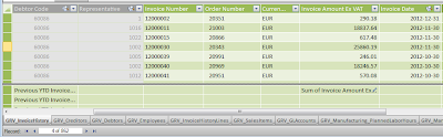
Dataset Invoices: Click to enlarge

Measures
In every dataset you can define measures. A measure is a formula that is created specifically for numeric data that you want to summarize or analyze in a PivotTable or PivotChart. Measures can be based on standard aggregation functions, such as COUNT, AVERAGE or SUM, or you can define your own formula by using DAX.
Example of measures on the Invoices dataset, like Invoices, Invoices per Customer, Invoiced customers, Average Invoice amount  etc.

Defined measures will be available in the Power Pivot field list and can be recognized by the calculator symbol.

Relationships between datasets  Datasets can be linked to each other by creating a relationship between the tables. The relationship establishes how the data in the two tables should be correlated. For example, a Debtor table and an Invoice table can be related in order to show the customer name that is associated with each order. After you have defined a relationship between tables in the Power Pivot window, you will be able to filter data by using related columns, lookup values in related tables, and integrate columns from multiple tables in a PivotTable. To understand with related columns can be used, you need to look to the defined relations. Open the Power Pivot window and press on the Diagram View button in the ribbon.
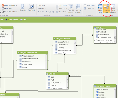
Diagram View: Click to enlarge
Time dimension dataset
To make use of the powerful Time intelligent functions it is recommended to create a separate related time table. To create such a table read: http://www.keepitsimpleandfast.com/2012/09/script-to-generate-time-dimension-table.html  The TimeDimension table contains characteristics of all days. For instance the day 24 may 2013. Some examples of the characteristics of this day: Year: 2013, Month: 5, It’s a Friday, Quarter 2, ISO week number: 21 All these different characters can be used in your pivots. Link your time dimension table to the date columns on your other datasets. For instance link Invoice date of your Invoice table to the date column.

This enables you to build revenue reports per week, month etc.
PivotTables and PivotChartsAfter having defined datasets, relationships, a date time table and measures, we can start building the reports.  Select the Power Pivot Tab in the ribbon, Select PivotTable and select what you want to insert.

You will get the Power Pivot field list which you need to use to define your chart. 

This will result in next chart:

Add a second chart or pivot to the same sheet. If you change slicer values of the previous chart, the added pivot or chart does not change. You need to link the added chart or pivot to the slicer. To do these select the added chart or pivot. Select the Pivot Table Tools, Options tab. Select Insert Slicer, Slicer Connections. You will get a list of all slicers. Select the slicer of the current sheet. The slicer is now active on both charts\pivots. You can check this by changing the slicer values.

Friday, May 24, 2013

How to retrieve IO statistics of SQL databases on file level?


Performance of a SQL database depends on different factors. One of these factors is disk activity, also known as Disk IO. With Windows Performance monitor (Perfmon) you can measure the performance of your disk. However if you have 4 database files on 1 drive, you do not know which of your databases is causing the most Disk IO. Within SQL Server you can use a dynamic view which will give you information on database file level.  Execute next statement on the SQL Server:

SELECT d.name  ,s.filename, NumberReads,  NumberWrites,  BytesRead,BytesWritten,
 IoStallReadMS, IoStallWriteMS, IoStallMS,BytesOnDisk
FROM Fn_Virtualfilestats(NULL,NULL) f
INNER JOIN sys.sysaltfiles s ON f.dbid = s.dbid and f.FileId = s.fileid
INNER JOIN sys.databases d ON f.DbId = d.database_id
ORDER BY IoStallReadMS DESC

This query will show next columns:

Name: Database name
Filename: Filename of the database file. Look to the extension to see if it is the MDF or LDF file
Timestamp: Database timestamp at which time the data was taken
Number of reads: Number of reads issued on the file
BytesRead: Number of bytes read issued on the file
IoStallReadMS: Total amount of time, in milliseconds, that users waited for the read IOs to complete the file
Number of writes: Number of writes issued on the file
BytesWritten: Number of bytes written issued on the file
IoStallWriteMS: Total amount of time, in milliseconds, that users waited for the read IOs to complete the file
BytesOnDisk: Physical file size(count of bytes) on disk.


With this query, you can look which databases are generating the most IO and time database files are waiting on the disk to get the required data. This can help you to decide to move some database files to seperate disks.

Friday, May 10, 2013

The connected user is not an Analysis Services server administrator. Only an administrator can make changes to server properties

You are a part of the local administrators group on the server. You want to add a user to the Server administrator group of your Analysis Server. After adding the user you will get next error message: The connected user is not an Analysis Services server administrator.  Only an administrator can make changes to server properties.

Solution: Start SQL Server Management Studio with the option 'Run as Administrator'. Now it is possible to add users to the Server administrator group of your Analysis Server.

Wednesday, April 10, 2013

The sqlncli10 provider is not registered on the local machine. Failed to connect to the server.


When you configure the data source of your Office 2010 Excel Power Pivot sheet, you can get the message:
Failed to connect to the server. Reason: The sqlncli10 provider is not registered on the local machine.

This can happen if you want to connect to a SQL 2008 (R2) server. On the client you need to have installed the Microsoft SQL Server Native Client (SQL Server Native Client). This is a single dynamic-link library (DLL) containing both the SQL OLE DB provider and SQL ODBC driver.

Solution: Install the sqlncli10 provider on your machine.

The sqlncli10 provider for SQL 2008 R2 can be downloaded from here.

X86 package.
X64 package
IA64 package.


In case you have a SQL 2012 server and have received a Power Pivot sheet which want to use the SQLNCLI10 provider, you can change the data provider to use to data provider for SQL 2012: SQLNCLI11

  1. Press the Existing connection button in the Power Pivot Window
  2. Select the PowerPivot Data Connection
  3. Press Edit
  4. Specify the SQL server name
  5. Specify the Database name
  6. Press the advanced
  7. Select Provider:  SQL Server Native Client 11.0  
In case you can't selected the SQL Server Native Client 11.0. The provider is not installed on your client. The SQLNCLI11 provider for SQL 2012 can be downloaded from here:
X86 package
X64 package

After installation it should be possible to configure your datasource, to be able to update your Excel Power Pivot sheet with all data.

Friday, April 5, 2013

Tsql script to see creation anf modification time of all indexes in database.

Next script will show the modification date of all indexes in the selected database.

Select s.name, t.name, t.create_date, t.modify_date,i.name, c.name
From sys.tables t
inner join sys.schemas s on t.schema_id = s.schema_id
inner join sys.indexes i on i.object_id = t.object_id
inner join sys.index_columns ic on ic.object_id = t.object_id
inner join sys.columns c on c.object_id = t.object_id and
             ic.column_id = c.column_id
Where i.index_id > 0   
and i.type in (1, 2) -- clustered & nonclustered only
and i.is_primary_key = 0 -- do not include PK indexes
and i.is_unique_constraint = 0 -- do not include UQ
and i.is_disabled = 0
and i.is_hypothetical = 0
and ic.key_ordinal > 0
Order by 4 desc

Thursday, February 28, 2013

Performance tips for your Power Pivot sheet


Power Pivot is a really good personal Business Intelligence tool with a great performance. However, for every tool there are tips to optimize the performance. In Power Pivot you need to define the BISM. (Business Intelligence Semantic model), please take next tips into consideration during the design of your BISM model:

  • Use views to import data in Power Pivot. The view will contain the business logic of how the data is stored in your database. If changes are made to your business logic, you only need to change the views. The Power Pivot sheet will still work.
  • Use logical columns names in the views. For instance [Account code] in stead of debnr. Everybody should understand what kind of content is stored in each column.
  • Import only columns you really need. Avoid SELECT * FROM MyView1 As described in my previous blog post: Memory management in Power Pivot, all data is kept in memory. Every column which is not used will use memory which can not be used for other purposes.
  • Import columns which are useful for analytics purposes. For instance for customer data: Account code, Country, State. Columns like street name are not so useful. As described here, it will create a lot of distinct values in your dictionary for this column. This will have a negative impact on performance.
  • Import DateTime columns in 2 separate columns. One Date column and one Time column. If time portion is not useful for your analytics do not import it at all.
  • Import master data in separate tabs. For instance all item attributes in one tab and use the item key in all transactional tabs. Link the item key from the transactional tab to the item key of the Item master tab.
  • Reduce the number of rows to import. If you analyse on month level, group all data in the view to the level you want. For instance group by Date, Item, Amount. This will save a lot of rows to import. Of course, this is not possible sometimes because you do not want to loose the granularity of analysis.
  • Reduce the number of rows to import by selecting only the subset you are going the analyze. For instance your database contains financial transaction as of financial year 2008. If you need to analyze of the current and previous year, import only the last 2 years.
  • Optimize column data types. A column with few distinct values will be lighter than a column with a high number of distinct values. This is important also for measures, which are considered also possible quantitative attributes. If the measure you are storing is a float and is the result of a calculation, consider reducing the number of digits to be imported. This will reduce the size of the dictionary, and possibly also the number of distinct values.
  • Avoid high-cardinality columns. Columns with unique ID's like invoice numbers are very expensive. Sometimes you can skip this columns and use the COUNTROWS function instead of the DISTINCTCOUNT.
  • Use measures instead of calculated columns if possible. Calculated columns are stored as an imported column. This does not apply to calculated measures. A calculated measure is calculated at query time.
  • In case you need to store a measure in a calculated column, consider to reduce the number of digits of the calculation.
  • Normalizing data doesn’t have a big effect on the size of the resulting database. However, it might have a strong impact on both processing time and memory required to process data. The key is to find a right balance. A Star schema is in most situation the right balance.
Enjoy it, to make your Power Pivot sheets even more powerful.

Wednesday, February 27, 2013

Memory management in Power Pivot: Column oriented databases.


Power Pivot is a perfect personal Business Intelligence tool. It is simple to use and the performance of the Power Pivot engine is really great. To better understand this engine, so you can even better make use of it, I will explain how this engine is working.

Row oriented versus column oriented databases.

All traditional relational databases, including SQL Server, are row oriented databases. They store data in tables row by row. The row of a table is the main unit of storage. Indexes are used to point to all columns of a certain row. It depends on the definition of the index which records belongs to this index.

A column-oriented database, like Power Pivot, uses a different approach. Every column is considered as a separate entity. Data is stored for every column in a separate way. I will explain this with an example.
 
ID
Car
Engine
Color
1 Audi A4 Petrol Silver
2 Audi A4 Gazole Red
3 Audi A4 Gazole Blue
4 BMW Petrol Silver
5 BMW Gazole Silver
6 BMW Gazole Red
7 Mercedes Gazole Blue

 Every column will have it's own sorted dictionary with all distinct values and a bitmap index references the actual values of each item in the column by using a zero-based index to the dictionary. Next table will show the dictionary values and index values.
 
Column
Dictionary
Values
ID
32,23,10,43,57,65,71
2,1,0,3,4,5,6
Car
Audi,BMW,Mercedes
0,0,0,1,1,1,2
Engine
Petrol, Gazole
0,1,1,0,1,1,1
Color
Silver, Red, Blue
0,1,2,0,0,1,2

As you can see, the dictionary can be the most expansive part of the index. Especially if a high number of distinct values exists in a column. The lower the number of distinct values in a column the smaller the size of dictionary for this column. This will make the value bitmap index more efficient.

The xVelocity engine, which is implemented on Power Pivot, is an in-memory database. This means that it has been designed and optimized assuming that the whole database is loaded in memory. Data is compressed in memory and dynamically uncompressed during each query. Because all data is kept in memory it is essential to be critical which data to import in your Power Pivot sheet. For instance customer data can be useful like, country, state. However street name is not efficient. Every customer will have a unique address which will result in a big dictionary without a low number of distinct values. It will have a high number of distinct values.

Enjoy the power of Power Pivot.

Monday, February 25, 2013

How to create XML with a TSQL query?

In this blog post I will describe how you can generate an XML file using TSQL statements. For instance for data migrations, you need to export data from your SQL database which can be imported via XML in another system.

The solution is really simple. Add ''FOR XML" to your SELECT query.

Example 1:
SELECT res_id, sur_name, first_name
FROM Humres
WHERE Res_id > 0
FOR XML PATH ('Resource')


The „FOR XML‟ always needs to be completed with the „AUTO‟ or „PATH‟ command:
  • When using „AUTO‟ command every column in the SELECT query will be handled as an attribute in a single element per records.
  • When including the „PATH(< path name >)‟ command the XML path can be set. Every records starts with its own parent element having the label as defined in the „PATH‟ command. Every column in the SELECT query will be handled as child element.
In this example the „PATH‟ command is used since this allows better control.
 
Example 2:
The next step would be to include custom column names to be used in the XML elements (rather than using „res_id‟, „sur_name‟, etc.) and include the resource number as an attribute in the „Resource‟ element.
 
SELECT res_id AS '@number',
 RTRIM(sur_name) AS 'LastName',
 RTRIM(first_name) AS 'FirstName'
FROM Humres
WHERE Res_id > 0
FOR XML PATH ('Resource')


Explanation:
  • Use a „@‟ in the column name results in an attribute
  • Including the RTRIM command trims the value (removing the extra spaces at the end of the value).
  • In many cases XML is case sensitive. Therefore make sure to use the correct attribute and element names.
Example 3:
A final step in creating a basic XML file would be to include the root element. A root element can be included by simply adding the command „ROOT(< root name >)‟ to the XML command in the SQL query.
 
SELECT res_id AS '@number',
 RTRIM(sur_name) AS 'LastName',
 RTRIM(first_name) AS 'FirstName'
FROM Humres
WHERE Res_id > 0
FOR XML PATH ('Resource'), ROOT('Resources')
 
 
Please note:
Sometimes a second root element is needed. For instance in Exact  (the element). Since the XML formatting of SQL queries only allows one root element, this can only be handled by using sub queries (or adding the root element manually to the output file). The use of sub queries will be explained in the following paragraph.
 
Example 4: Creating child-elements
There are two ways of generating child-elements as part of your parent element (which is defined in the „PATH‟ command and applies to every record).
Example 4.1 Child elements with 1:1 relationship
The first way can only be used in case there is a 1:1 relationship between the parent element (in our example the resource records) and the child element (in the example below the title record). In this case the child-element can be generated by including the element name in the column names (in the SELECT section):

SELECT
h.res_id as '@number',
RTRIM(h.sur_name) as 'LastName',
RTRIM(h.first_name) as 'FirstName',
RTRIM(p.predcode) as 'Title/@code',
p.aan_oms as 'Title/Description',
p.aanhef as 'Title/Salutation'
FROM humres h
LEFT JOIN pred p ON h.predcode = p.predcode
WHERE res_id > 0
FOR XML PATH('Resource'), ROOT('Resources')
 
 
Explanation:
  • A LEFT JOIN on table „pred‟ has been included to get the prefix data.
  • Correlation names „h‟ and „p‟ have been included to easily refer to the correct tables (in this case „humres‟ and „pred‟).
  • By including a forward slash (“/”) in the custom column names, a child element can be generated. The child element name needs to be defined on the left side of the forward slash.
  • Multiple forward slashed can be used in the column names to use deeper child element levels.
Example 4.2 Child elements with 1:N relationship
In case a 1:N relationship exist, such as one customer having multiple contacts, the child elements should be generated based on a sub query which gets all matching records. In our example, using the resources table, the resource is the parent element and the roles are the child elements. The sub query should get all roles linked to the resource and generate the corresponding child elements.
First create the sub query with a XML mark-up to get all roles:
SELECT
r.RoleID as '@code',
r.RoleLevel as '@level',
rd.Description as 'Description'
FROM humres h2
LEFT JOIN HRRoles r ON h2.res_id = r.EmpID
LEFT JOIN HRRoleDefs rd ON r.RoleID = rd.ID
FOR XML PATH('Role'), ROOT('Roles')


Explanation:
  • The query gets all resources (humres), linked to roles (hrroles) and the role details (hrroledefs).
  • The correlation name for humres is set to h2 since this query will become a sub query in which “h” already exists.
Next, this query needs to be part of the main query. This can be done by including it in the SELECT section of our main query and by making sure the sub query returns only the roles per specific resource.
 
SELECT
h.res_id as '@number',
RTRIM(h.sur_name) as 'LastName',
RTRIM(h.first_name) as 'FirstName',
RTRIM(p.predcode) as 'Title/@code',
p.aan_oms as 'Title/Description',
p.aanhef as 'Title/Salutation',
(
SELECT
r.RoleID as '@code',
r.RoleLevel as '@level',
rd.Description as 'Description'
FROM humres h2
LEFT JOIN HRRoles r ON h2.res_id = r.EmpID
LEFT JOIN HRRoleDefs rd ON r.RoleID = rd.ID
WHERE h2.res_id = h.res_id
FOR XML PATH('Role'), ROOT('Roles'), TYPE
)
FROM humres h
LEFT JOIN pred p ON h.predcode = p.predcode
WHERE res_id > 0
FOR XML PATH('Resource'), ROOT('Resources')


Explanation:
  • In the WHERE section of the sub query the filter „h2.res_id = h.res_id‟ has been added to make sure only the roles per user are taken.
  • In the FOR XML section the command „TYPE‟ has been added. If left out, the query result of the sub query will be alphanumeric (varchar) instead of XML. This means, with the „TYPE‟, the sub query result will be printed as a text/string.
  • Note that in this case it is “legal” to have multiple records and fields coming from a sub query. In standard (non-XML) SELECT queries having a sub query in the SELECT should only result in one record and field.
Example 5. XML file format
When running a SELECT query with XML commands, the XML output is in „Unicode (UTF-8)‟ coding by default:


When saving the output file, the file format will be using this encoding. Therefore, make sure to select the correct encoding type supported by the target application. (One of) the encoding type supported by Exact is „Western European (Windows)‟.
 
Enjoy it to create your own XML files via TSQL.

Monday, January 21, 2013

Design tips for My favorite dashboard.

Dashboards are very popular way to display data. Other popular names are (performance) cockpits. Sometimes I see dashboards for which I think, which vision is used to build such a bad dashboard. If you start building a dashboard without a vision it will end up in a dashboard which maybe looks nice as a first impression, but is useless on a daily basis. In this blog post I will describe my vision how you should build a useful dashboard. First of all I will start with 2 examples of a dashboard. Both will show the same information. The only difference is the presentation of the data. Examples are the best way to explain.
Let's start with a dashboard in which a lot of improvements can be made:


Now the same information in presented in a better way:


I will comment on the dashboard which can be improved. In general one rule can be applied: Keep in mind. Less is better.


  1. Report title in big font and printed Bold. Goal of the dashboard is to show attention to the figures not to the title.
  2. Gray background in the report. This is visual fluff. The gray color has no function. Keep in mind. Less is better.
  3. Axe values. A lot of zero's is expensive space and is difficult to read. It will make the bar chart it self smaller. We read with our brains. Is the axis value 200.000 or 2 million? 
  4. Red color of the bar chart. Is something wrong? Colors have a function. Red is a color to grab attention that something is wrong (STOP). In this example nothing is wrong. Revenue is better than previous year.
  5. 3D graph. A dashboard is not a painting. The dashboard is used in a business environment. Not in a gallery. Always use 2D graphs. They are easier to read and understand. For example: What is the value for period 2 of previous year?
  6. Aqua color with gradient style center. This is visual fluff. Keep in mind. Less is better.
  7. Legend takes a lot of valuable space which result in a smaller bar chart. It's not the legend but the chart which need to most space. 
  8. Numbers should not be center-justified in the columns. Right-justified is easier to compare when scanning up and down a column.
  9. Use grid lines carefully. Keep in mind. Less is better.
  10. Matrix header in bigger font, printed bold on a colored background. One way of visualization is enough to emphasize difference between the lines. Using a list level for other lines will show difference between header and sub-lines. Keep in mind. Less is better.
  11. Underline the header. This is useless. Keep in mind. Less is better.
  12. Repeating currency symbol. One currency symbol is enough. Is will save value space in every column.
  13. Hyperlink to other report is printed in the same font color. Use a other color for hyperlinks, so the user can see that a hyperlink to another report is available.
  14. Remove the border of the bar chart.
Some more remarks to take into account during the design of your dashboard.
  • A dashboard is used on a daily basis. Display only data which needs your attention, so you can take action to improve. Report the KPI's which needs improvement. The dashboard need to help you to achieve your goal. Data content which will not change overtime is use less on a daily used dashboard.
  • We do not see with our eyes, we see with our brains. Content on the dashboard should be clear to understand. If people need to think about what they see, you need to change the visualization of your information.
  • A dashboard should fit on one screen. Avoid scrolling bars. With scrolling bars, it can happen that something that needs your attention (RED) is outside your screen.
  • Do not use shadows. It is visual fluff with no meaning.
  • Do not use logo's and pictures. It is wasting your valuable space. If needed make it small and place it somewhere out of the way.
  • What do you want to show or compare? Based on this select the best visualization for it. See : http://www.keepitsimpleandfast.com/2012/07/which-visualizations-should-i-use-in-my.html For example using a pie chart to compare 2 values can be useful  However it can take a lot of useful space. Do not use is to compare multiple values especially if you do not know how many values you need to compare. A bar chart is better in this situation.
  • Display consolidated information, summaries or exceptions. Do not display details. Details are used in slice and dice reports to explain the consolidated information, summaries or exceptions.
  • Put data which is relevant to each other, close together.
  • Use a gray color for your fonts instead of black.
Enjoy it to build dashboards to deliver a good user experience for your users. 

Monday, January 14, 2013

Display last refresh time in Power Pivot

With Power Pivot, you can start analyzing your data off-line. After importing the data you do not need a database connection anymore. A lot of people want to know the date of the last time that the Power Pivot data is refreshed. You can do this in the following way:
Add a tab (LastDataRefreshTime) to the Power Pivot window and use next query:

SELECT GETDATE() AS LastDataRefreshTime

After adding the tab to the Power Pivot Window, one record is added in this sheet. This record can be used in you Power Pivot Sheets.

Select the tab in your Excel sheet on which you want to add this LastDataRefreshTime.
Add a Pivot table and select LastDataRefreshTime from the PowerPivot Field List.


By default the measure is added as a SUM. Change this to MAX.


The last data refresh time will now be displayed in your sheet.
Enjoy the Power of Power Pivot.

Friday, January 11, 2013

Exception from HRESULT: 0x800A03EC during starting Power View in Office 2013

In Office 2013 you can enable Power Pivot and Power View. After opening a Power Pivot sheet you can start using Power View. Power View can be found in the Insert Ribbon of Office 2013.

After pressing the Power View icon next error can occur:
Exception from HRESULT: 0x800A03EC


This error can occur in next situation:
  • You have created a Power Pivot sheet with Power Pivot version 11.1.3000 in Office 2010.
  • You opened this Power Pivot sheet in Office 2013.
  • You press the Power View button in the Insert Ribbon of Office 2013.
Solution: Upgrade your Power Pivot datamodel to datamodel of PowerPivot for Excel 201. To do this follow next steps:
  • Open the Power Pivot sheet Version (11.1.3000) in Office 2013.
  • Select the Power Pivot in the Ribbon.
  • Press the Manage Data Model button in the  Power Pivot Ribbon.
  • You will get next message:  This workbook has a Power Pivot data model created using a previous version of the PowerPivot add-in. You'll need to upgrade this data model with PowerPivot for Excel 2013.
  • Press OK
  • Start the upgrades of your Power Pivot model.
  • After upgrading successfully, you can press the Power View button to start using Power View.
Enjoy the Power of Power View.